In the previous post, I described the whole process of calibrating cameras in such a way as to obtain consistent colors between different models and even brands. Now I will show you how to master the colors in photos in difficult lighting conditions with the help of the X-Rite Color Checker Passport stencil. I will also show how to use it in product photography or portrait where colors must be rendered perfectly as in reality.
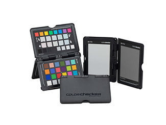
Perfect colours for product photography and sessions
You can use these methods in all conditions, even studio ones where the light is often of very good quality, but you care about the perfect color rendering and correct white balance. Sometimes there may be some additional light source or other factor that will affect the colors and we can miss it during the session, even a cheap light modifier.
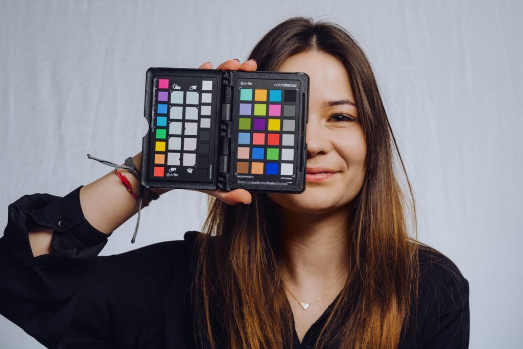
Color rendering is particularly important in product photography, where we must maintain the consistency of colors of what we photograph, with what we save on the computer, and sometimes for printing. In this case, working with the stencil seems necessary. Because the stencil gives us a point of reference.
Color problems in poor lighting
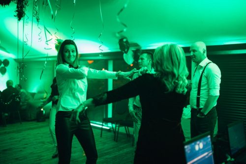
The other side of the problem with colors are situations in which we photograph in the light of cheap LED bulbs, fluorescent or other inventions, or in a mixture of such lights. In such sutations, it is more difficult to find the right white balance, or it seems impossible. Also in poor light, some colors may appear less saturated, due to the fact that the light source has a jagged spectrum.
What is a jagged light spectrum and low CRI?
You’re probably wondering what this jagged spectrum of light is? Let me explain.
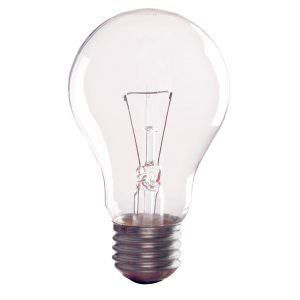
It is primarily about the color rendering index – it is the so-called CRI (Color Rendering Index). Our sun has a value of CRI = 100, but artificial light sources can barely match it. The closest to the ideal is an ordinary light bulb (one with a tungsten wire, once used in every home) and some halogens. A very good result will be a CRI>value of 90. However, you have to be careful about the understatements of manufacturers.
As a rule, it looks like this:
- CRI 100 – sunlight, light bulb, halogen
- CRI>80 – good LED bulbs
- CRI<80 – Fluorescent lamps and other inventions
- CRI=20 – Once used sodium lamps on the streets giving the effect of sepi. Today replaced by LED light.
How does CRI count?
I’ll show it in the example below.
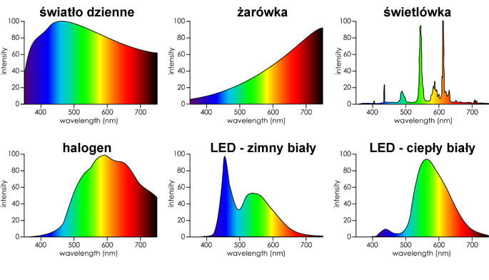
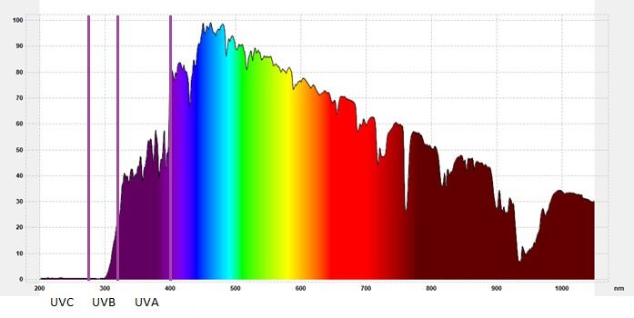
What you see are light spectra for exemplary types of light. On the graphs there is a wavelength that is responsible for a given color and the value of its saturation. If we have a hole around 650 nm, our bulb has a problem with colors similar to red.

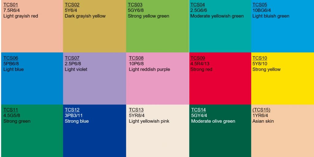
When counting the CRI values of the 8 colors or 15 reference colors taken and based on their mapping, the average CRI is determined. Therefore, even a light bulb with a high CRI on paper may have a problem with the color that is not used in the test, or the only one is a little worse, but the average will still be counted high.
What is the difference between CRI(Ra) and CRI(Re)
Most manufacturers of light bulbs that we buy en masse in stores and DIY stores have a CRI(Ra) value that shows us to what extent its light reflects the reference colors. With the difference that 8 pastel colors (always something) are taken into account for the tests and their degree of reproduction is checked.

CRI(Re) gives you more!
For nosy people (like us) more interesting will be the cri(Re) value which contains 8 pastel colors given at CRI (Ra) + 7 additional colors , among which we find intense red, green, blue and navy blue as well as shades resembling skin color. In this way, the given CRI value (Ra) already contains almost twice as many colors, as many as 15. This can be compared to examining light bulbs with Color Checker which also contains a similar set of “difficult colors” and shows which colors can be seen well and where there are deficiencies.
Light modifiers can also affect color
By the way, I will also add that if we do not use studio equipment for millions of coins, then even our lamps can slightly change their (slightly, but always something) values. In addition, there are also modifiers and their materials for which professional studios are willing to pay accordingly. See that the color picker itself will be a plate with colored squares for some, and for others a work tool that allows us to tame colors. At flash light
How to cope in difficult conditions?
Since we already know that our or someone else’s (e.g. parish) light bulbs have low CRI, we know how to deal with this problem. We have X exit solutions.
- We do in such a light and accept that we have such a climate
- We take photos in black and white so as not to get tired of white balance and colors
- We bring our own bulbs (joke)
- We flash or shine a “good light”
- We take a photo of the sampler in these conditions and make a profile for the existing scene
Below I will describe how to make such a profile.
10 Steps to Calibrate your Camera During a Session
He will now show on the example of our session to Agnieszka’s ID card how to do a quick calibration during a session with flash units. I use Adobe Lightroom Classic and Adobe Photoshop CC to work. In this case, if we do not change the settings of the light and lamps, we only need one photo of the sampler, which will be well exposed. So here we go:
1. We buy X-Rite ColorChecker Passport or Classic
if we have it, we skip this step. If not, you can look for it on Ceneo. Sometimes there are also cool promotions with a 50% discount on the Adobe Creative Cloud plan. I used it myself.

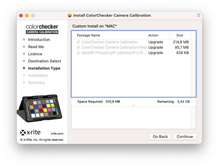
2nd Install the X-Rite ColorChecker software and the plugin for Lightroom.
Everything can be found on the included board or on the X-Rite website – here.
3. During the session we take a photo of the sampler
It is best if it will be in the place of the face of the photographed person, when we set the lights for the session. Of course, the photo is taken in RAW format.
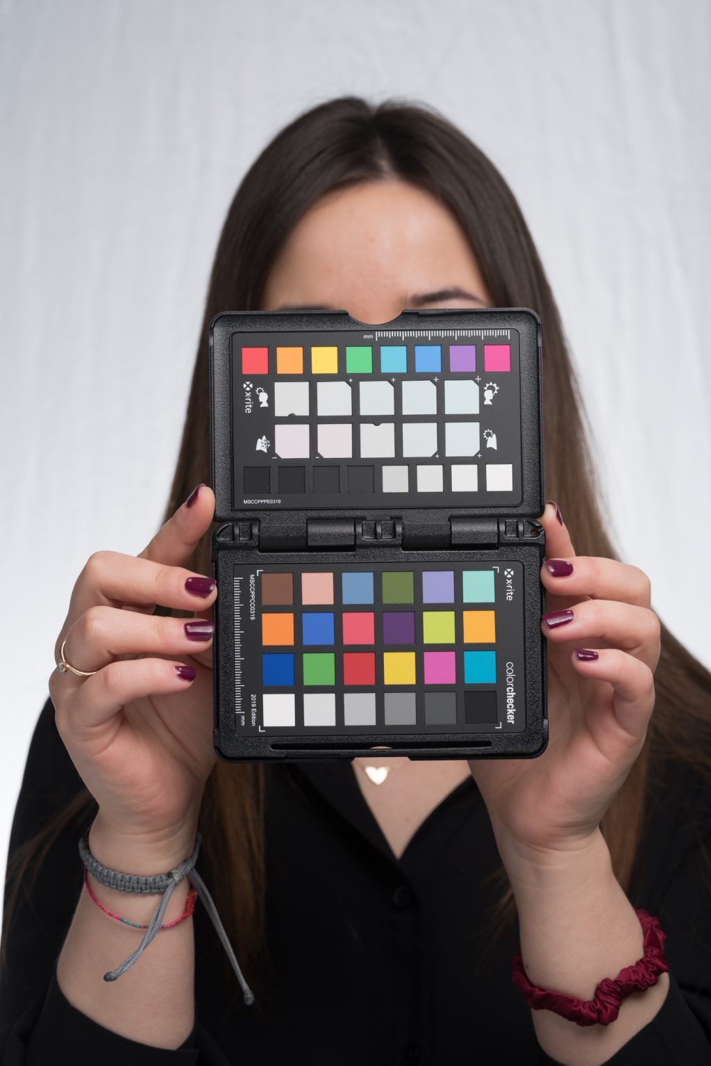
4. Import photos into Lightroom
I recommend converting to DNG
5. Choose a photo with a sampler
It is important that the photo is well exposed, sharp and does not have reflections on color samples.
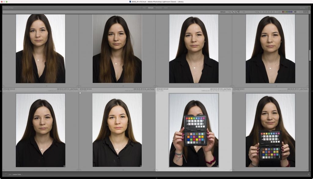
6. Export the file using the X-Rite ColorChecker plugin
The plugin will save the photo itself and create a profile. We have to determine its name at the beginning.
If everything was ok, we go to point 7. If not, we can choose a different photo or crop the sampler.
To do this, click on the photo with the right button and select Export>X-Rite ColorChecker Camera Calibration.
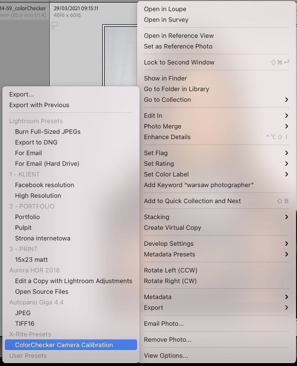
Then a window will appear in which we call our DNG profile.

7. Restart Lightroom Classic
Without restarting, Lightroom won’t see the profile you just created.
8th Select the profile in the Develop module
In the Develop module, on the right panel, in the Basic section, click “Profiles“, and in the list that expands, click Browse. We can also click on the 4 squares on the right. We will see different groups of profiles:

- Favorites – those that will be in the drop-down list
- Adobe RAW – Profiles from Adobe
- Camera Matching – Profiles pretending to be those from our Body
- Profiles – Our profiles
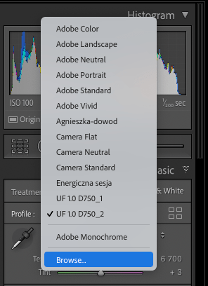
In Profiles , we look for the profile we have created and, for convenience, we can click on the whistle next to it to add it to the drop-down list of favorites. We can also wedge and then copy/sync to other photos.

9. Choose white balance
If we took a picture of a gray card from the sampler, we will set the balance on its basis. And if not, we can use the gray field from the sampler. For this purpose, we use a pipette in the Basic tab, or the “W” shortcut on the keyboard.
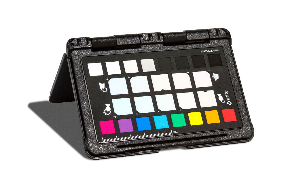
For more creative applications, you can use the field next to which we have pictures of people faces and mountains, which allow you to warm the skin tones, or deepen the saturation of greens or blues of the landscape if you shoot outdoors.
10. Copy the profile to photos from the session
After applying the profile, we can set or copy it to the rest of the photos from the session. And we can do the same in studio conditions as well as difficult lighting conditions. It is important to set the stencil so that the light in which it will be photographed falls on it.
This is the color difference in a photo where the default Adobe Standard profile is applied and the same photo with the created profile. Pay attention to the big difference in shades of blue and more natural skin tone.


You are absolutely right!
Using perfect color in photo is an important part whether it is product photo editing, portrait, landscape or headshot. Your article teach me more about using color perfectly for photo editing.
Thank you for your positive comment! I’m glad that the article contributed to your knowledge about using colors in photo editing. I agree that choosing the right colors is crucial in photography, whether it’s for editing product photos, portraits, landscapes, or headshots. It’s always worth experimenting and refining skills in this area. If you have any questions or would like to share your experiences, feel free to reach out! Best regards!